Hey Doctor
Identity and naming for an exam and medical clinic with accessible prices.

Context
The Santa Group Company noticed an increase in the amount of the population in Brasilia that didn’t have access to basic medical exams and appointments. They took advantage of the gap in the market to create an office to attend these people at accessible prices.


Solution

Solution
We created a name which proposes a certain informality that references how some people speak with doctors in Brazil, suggesting an intimacy between doctor and patient.
Result
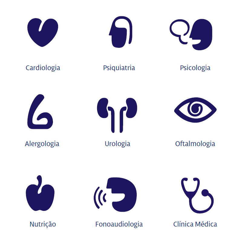
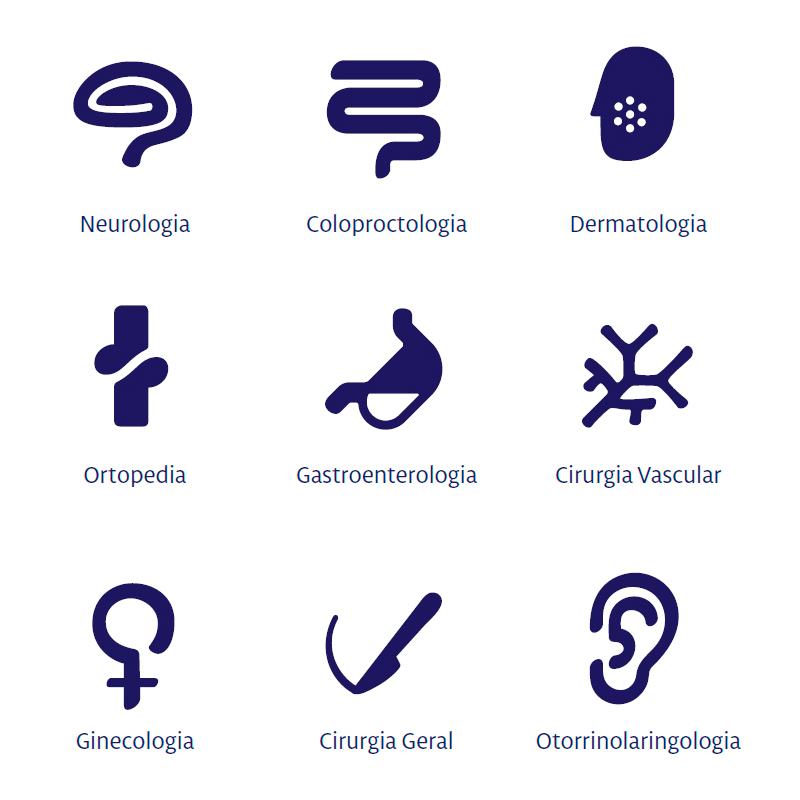
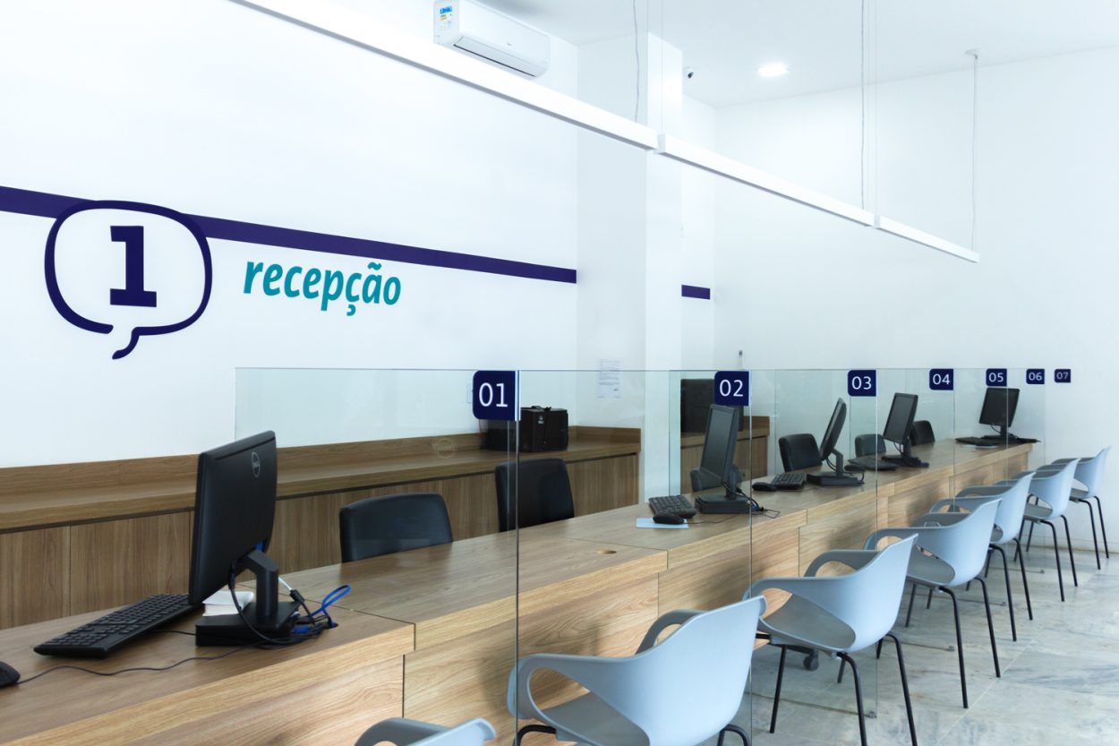
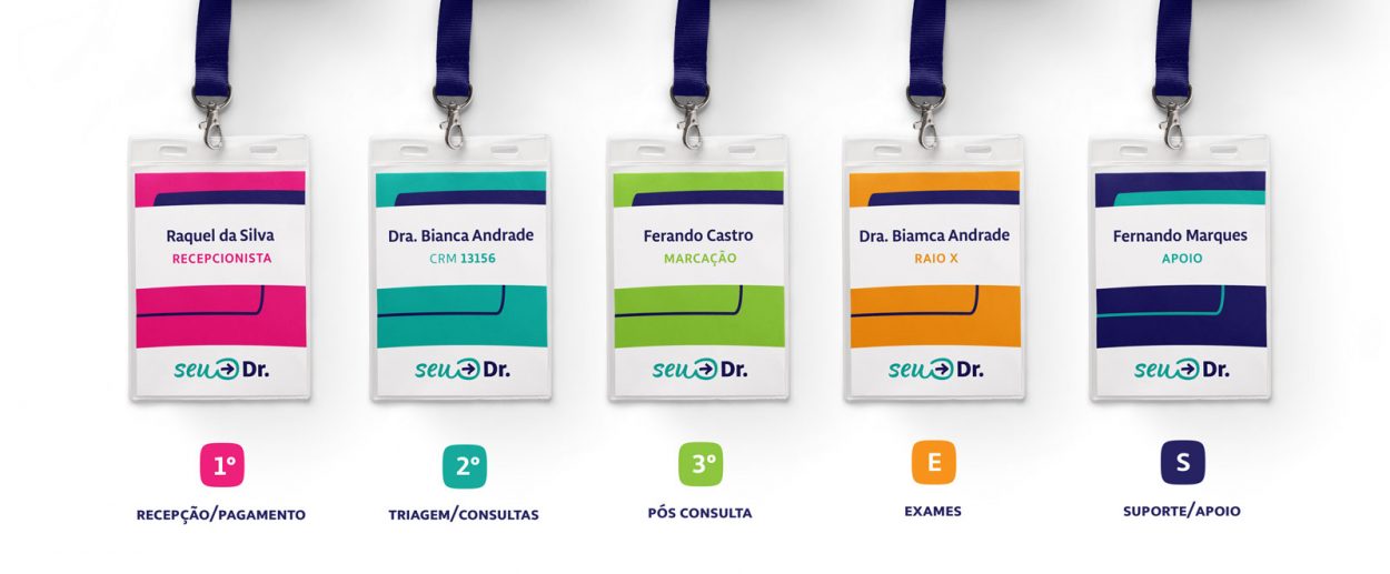
Beyond the name, we developed a logo to be applied to the office materials. We used an exclusive design in the style of a manuscript to reinforce the human responsibility of the brand and push away the cold image common to hospitals. All of the communication was designed to be humanized and attractive.