Oxen Crossfit
A distinct visual identity transmits the values of the brand and differentiates it in an increasingly competitive market.

Context
How to be bold and differentiate oneself in an expanding market? The construction of the visual identity was extremely important as a tool to differentiate it from the customers. They sought us with a challenge to create a brand that wasn’t typical, making it a business that became a reference in the local market.
Challenge
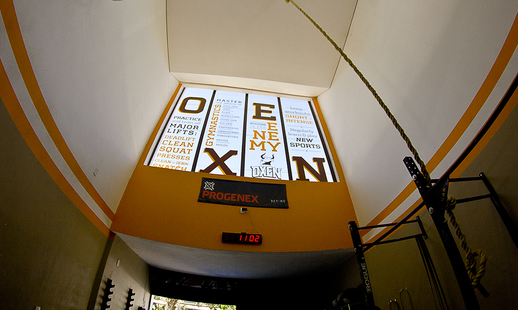
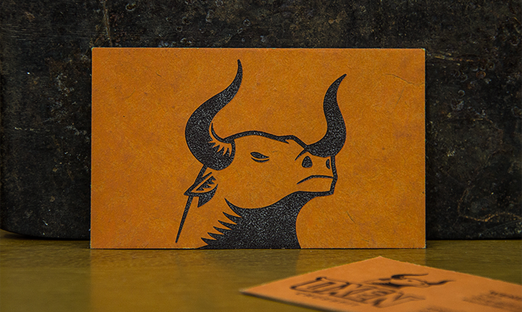
The name Oxen was chosen by the client as much for the sound of the word as its symbolism of strength. Just as with the name, the brand should visually transmit the idea of force and imposition, while avoiding showing crossfit artefacts, a habit common among the competition.
Result
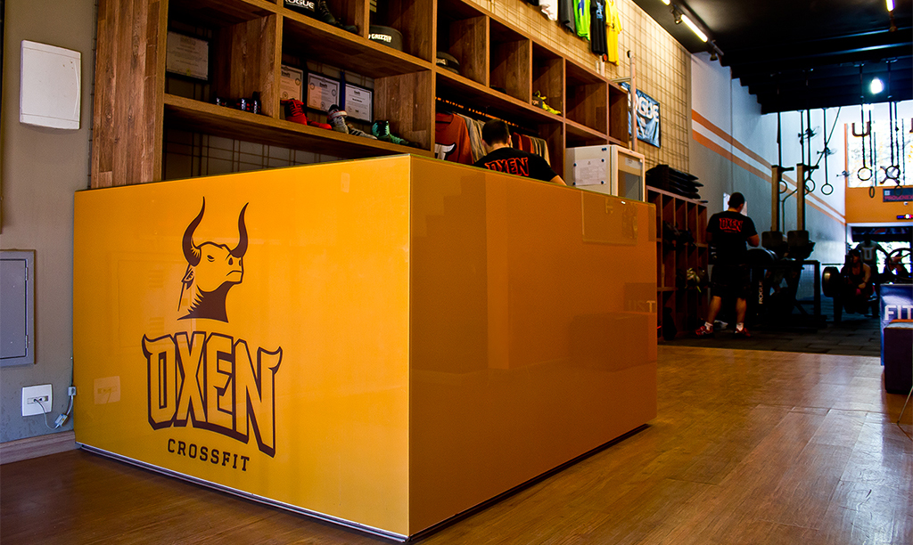
The result was the creation of a strong and exclusive brand symbol, easily applied in various settings and with a high variety of defined and memorable colors, not to mention a unique and unmistakable logo.