Mathesis Group
Corporate governance with security and warmth

Context
The Mathesis group has worked on the governance market for many years, earning a reputation for security, confidentiality and credibility. While seeking to refresh their communications strategies, it became clear that even with a proven product, the company image was outdated and unaligned with company principles, thus illustrating the need to reposition the brand. It was time to create a visual language that represented security in a more up-to-date and human way.


Solution

Solution
The Mathesis group has diverse fields of governance activity within the company, such as corporate, labor, tax, familial and organizational, with each possessing its own brand. As they are part of the same group, these different fronts required a unique personality that also worked in harmony with one another.


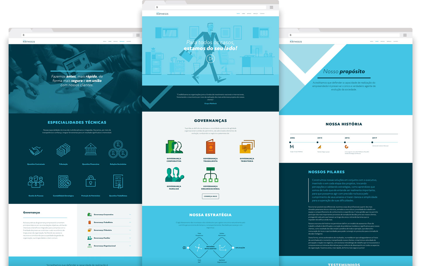
Mathesis Animation
In conjunction with a more attractive and up-to-date website to express the new identity, we also created an animation to explain the company’s areas of activity in a quick and fun way.


Result
With a new strategy for communications and brand positioning, the Mathesis Group now exudes more personality, and is gaining traction in communications and engagement, making it a reference in the area.