La Boulangerie
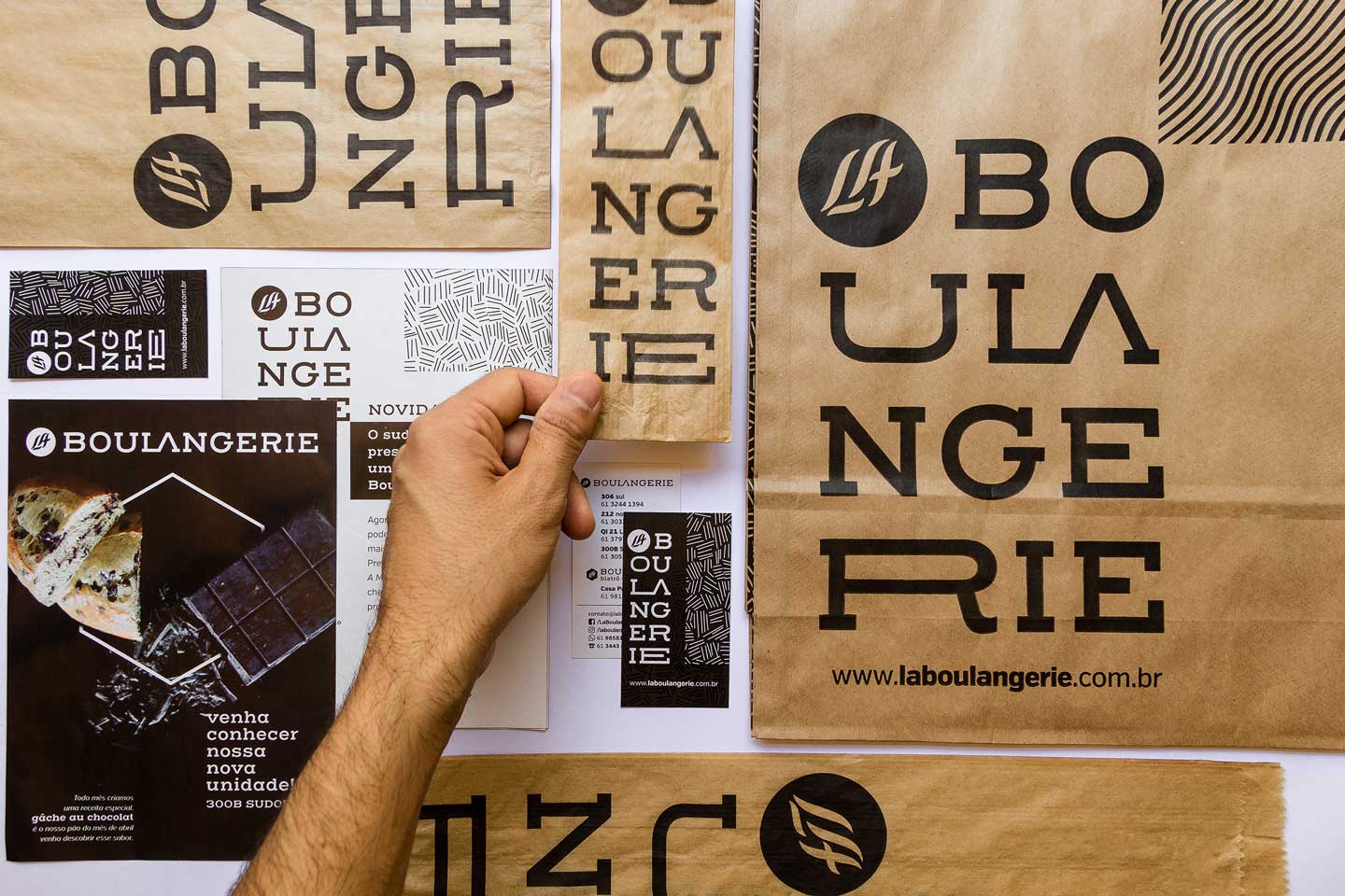
After being awarded the Best Bakery in Brasilia by numerous publications, La Boulangerie evolved to a new phase.
Context
Beyond the breads produced according to French “savoirfaire”, the brand will begin its first operation as a bistrot, opening up the possibility for a new visual identity. We identified essential elements for the new visual identity: to present new business perspectives, reinforce their position at the forefront, and to confirm their calling to produce classic recipes.
Challenge
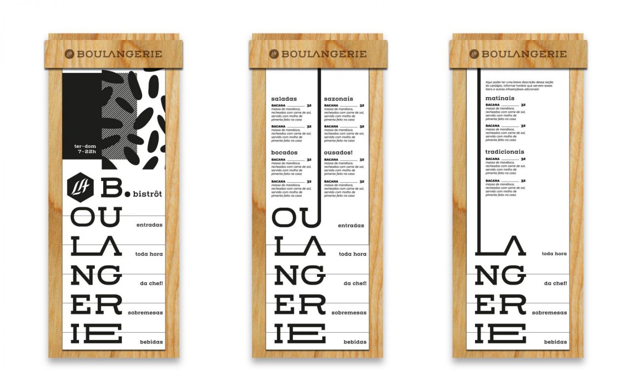
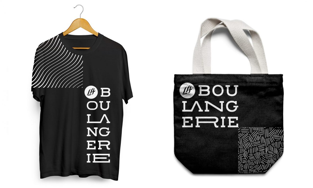
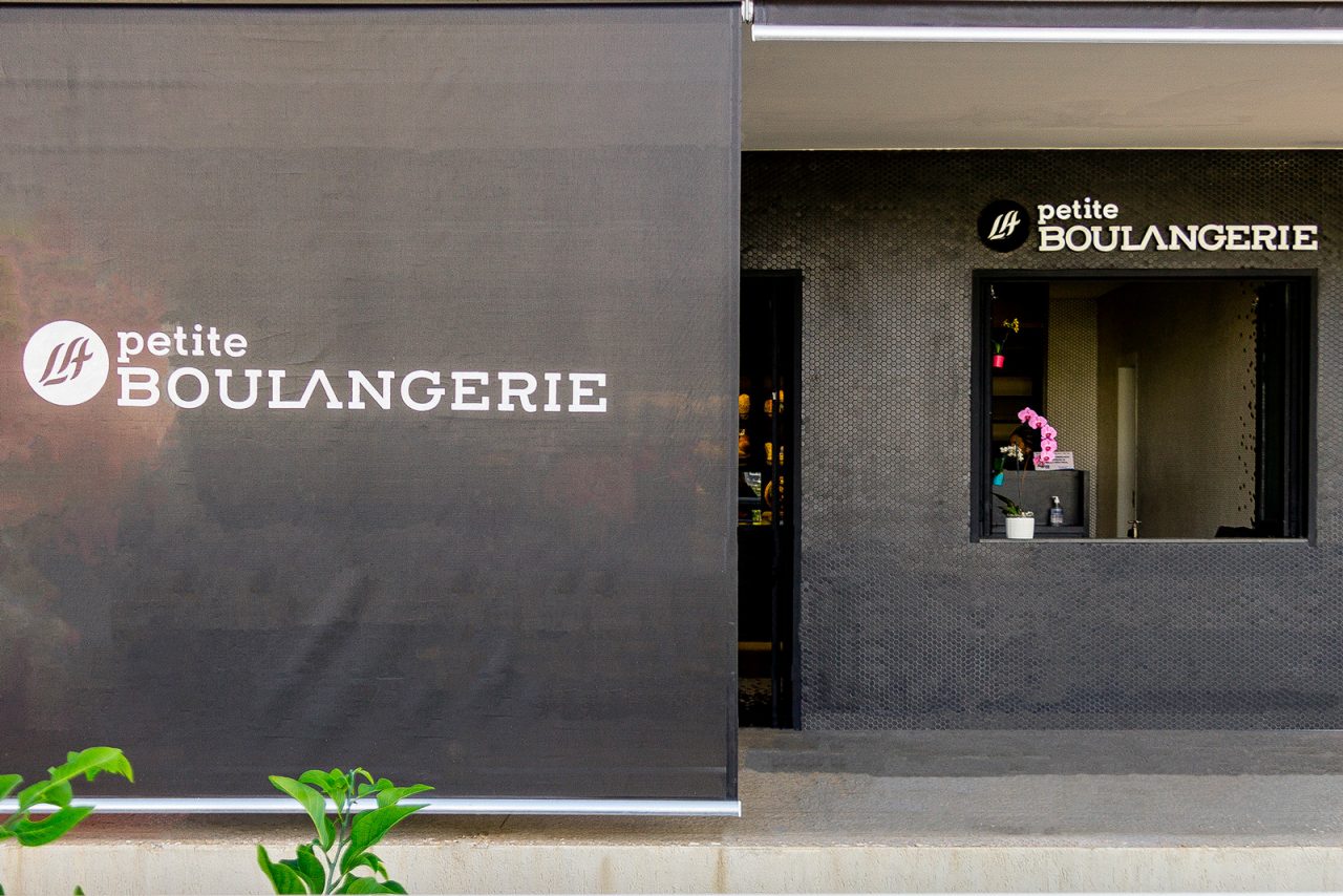
Open more than 10 years and known for the quality of their products, it was time for their visual identity to gain the same attention. We created a new language which involved architecture (projected by the “Bloco Arquitetos Associados”), visual identity and communication. Because it dealt with a brand whose products are well-known by the public, it was necessary to visually differentiate itself from the competition.
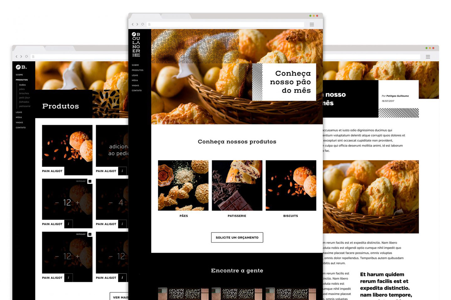
Because it dealt with a brand whose products are well-known by the public, it was necessary to visually differentiate itself from the competition.
Outcome
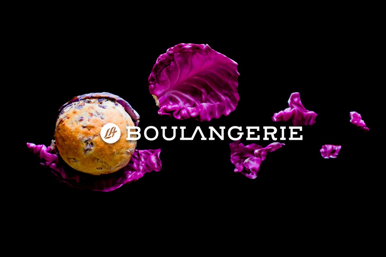
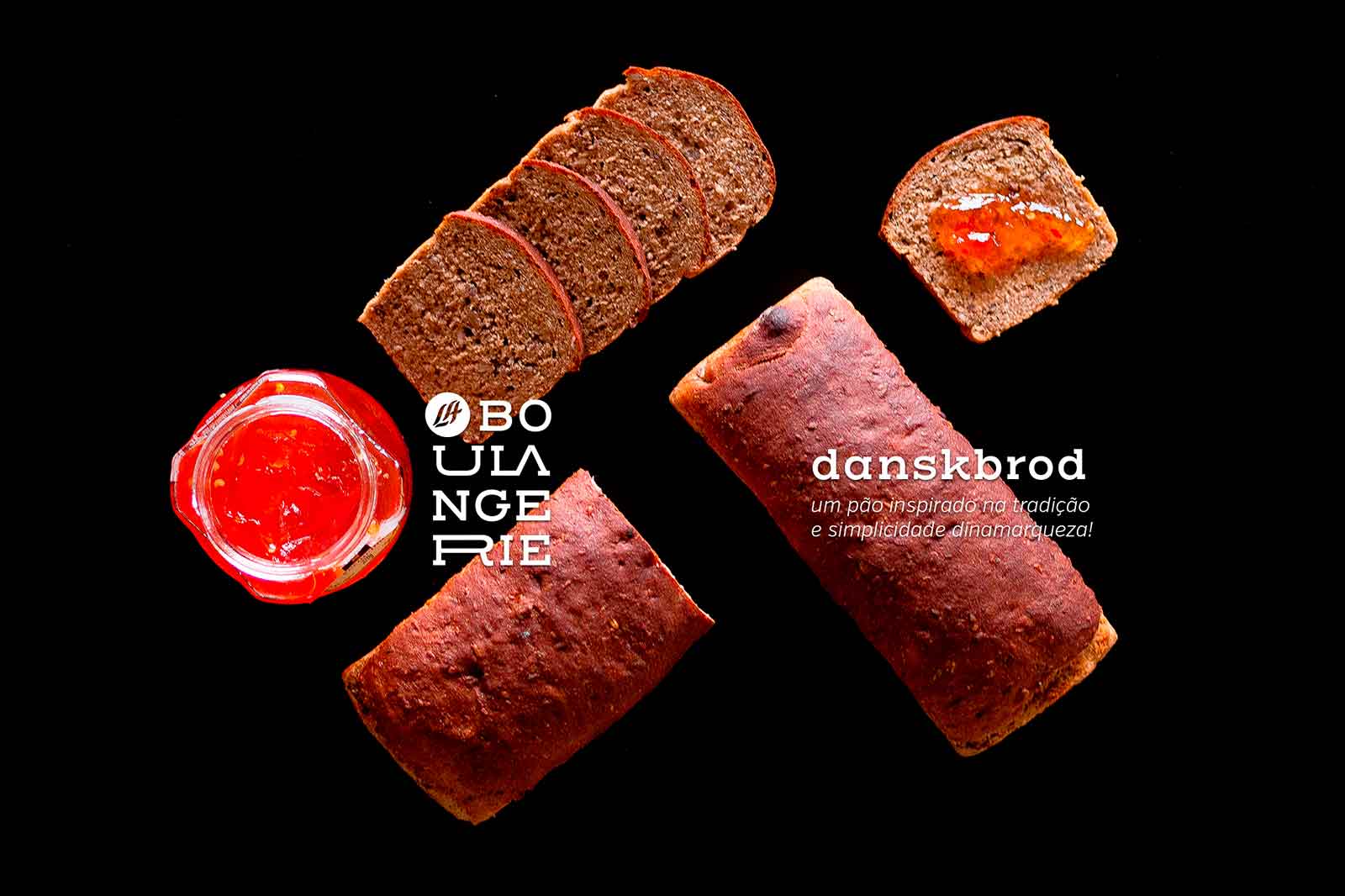
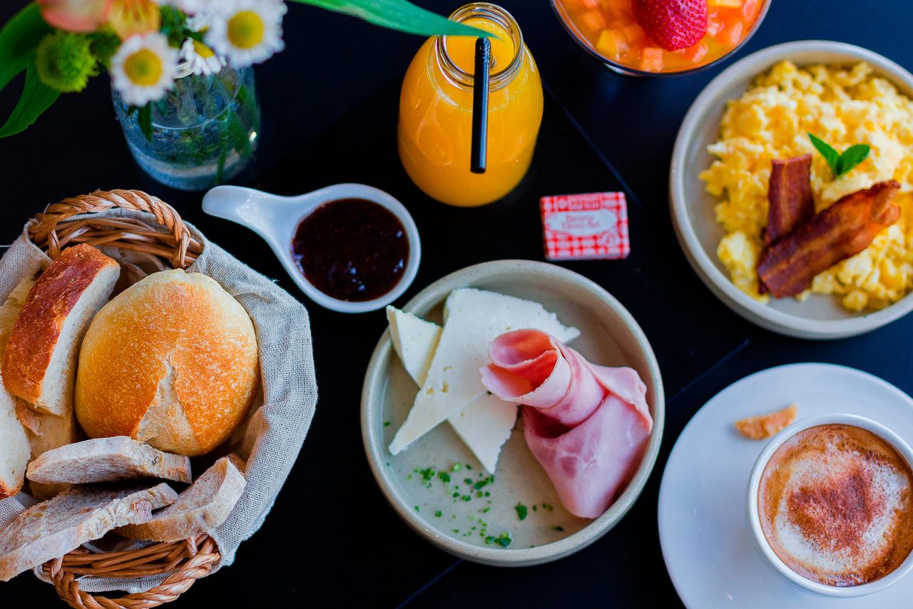
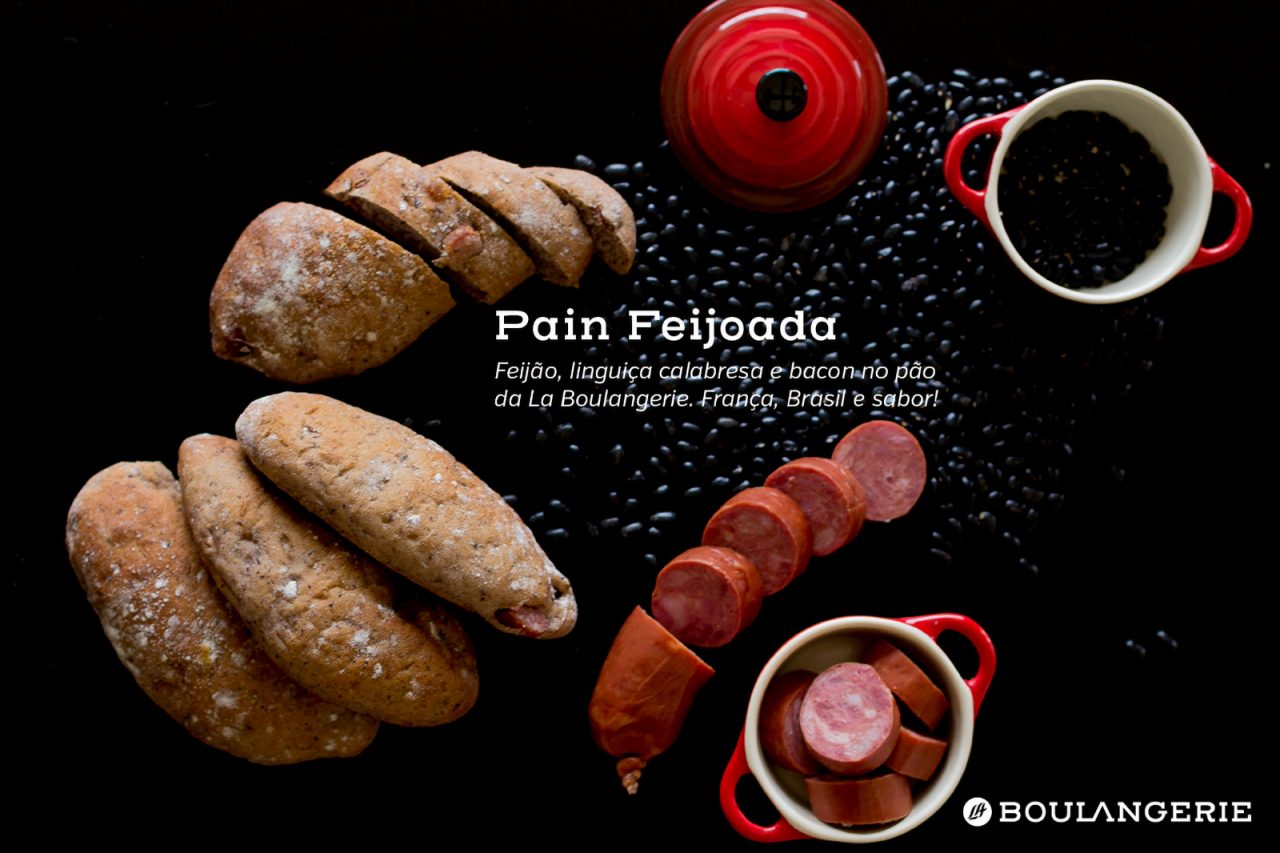
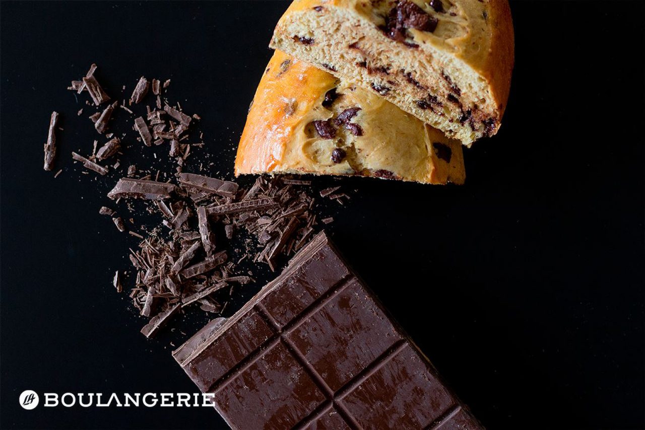
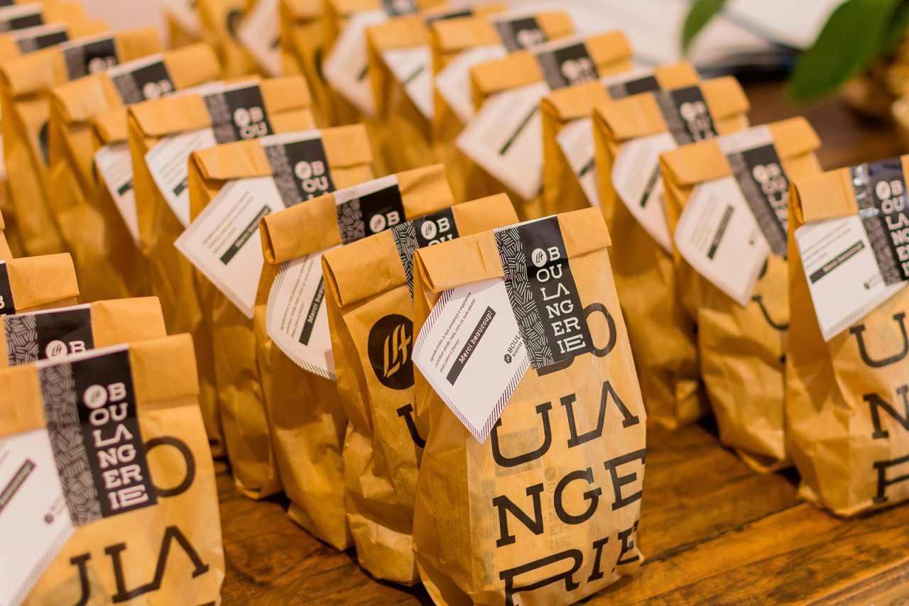
The visual identity created for La Boulangerie highlighted it once more within the segment. Qualities like innovation and prominence - reinforced in the research phase - allowed us to generate elements that identified clearly with the products and intentions of the company. The result is seen in the points of contact with the brand: packaging, training materials, use of photography in campaigns and on the site, among others. All was done with care and according to tradition. Voilá!